Exploring ggplot2 with Karthik Ram’s Talk
I have lately been learning a couple of tools for data science. After hearing about ggplot2, I came across Karthik Ram’s talk about Data Visualization with R & ggplot2. It’s an excellent talk to introduce yourself to ggplot2. This post will discuss the solutions to the exercises in the talk. Karthik is an ecologist at UC Berkeley and this talk was presented at an R seminar for Integrative Biology students.
This brief lecture can be found on inundata. The slides are on Speakerdeck and the full repository is accessible at Github
How to use this guide?
I will not go through each and every slide. The talk is self-sufficient and you should be able to solve the exercises all by yourself. This post will only serve as a supplement to the talk and help you verify your solutions. I should also mention that I am only a novice R programmer and my intention to publish this guide is only to learn more clearly about the package.
There is a golden rule I follow while going through any kind teaching material. That is to never copy commands. Type exactly what is shown, no copy-paste! This may come to you as a moot point but it serves very effectively when you make slight efforts to learn the material.
Introduction to ggplot2
ggplot2 is one of the finest graphics package you will come across in R or elsewhere. The ‘gg’ stands for Grammar of Graphics which was a path breaking book by Leland Wilkinson that inspired Hadley Wickham to make this wonderful package. If you are teaching yourself data visualization recently, Wickham’s course on Data Visualization, stat645, is one the few places to keep a close eye on for all the amazing resources that get shared there.
To start right away, we will first install our favorite R packages. Start R console or RStudio, whichever you prefer.
install.packages(c("ggplot2", "plyr", "reshape2"))If you have the latest version of these 3 packages already installed, you can skip to the next section. To use these packages, execute libary(X) where X is the name of the package.
Exercises
Exercise 1
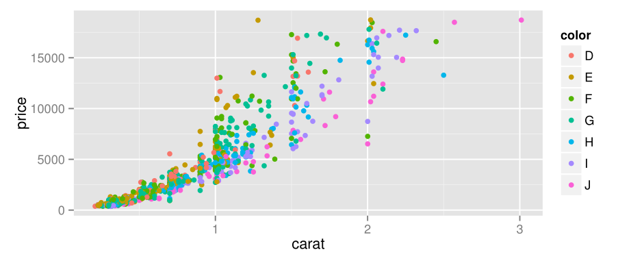
This exercise uses a sample data frame from the dataset diamonds. sample(1:dim(diamonds)[1], 1000) gives a vector of length 1000 with randomly selected integers from 1 to 53940(number of rows in diamonds)
> ggplot(data = d2, aes(x = carat, y = price, color = color)) +
+ geom_point()
It makes use of differentiation related aesthetics. color = color sets d2$color to color attribute of aesthetics. This way, the color of the points become function of the value of d2$color. It is always helpful to take a look at the dataset before plotting. Use head(diamonds) or str(diamonds)
Downloading Climate Dataset
If you’re on a windows machine, you might have a hard time downloading climate.csv. I was getting the following errors,
> climate <- read.csv(text = RCurl::getURL(https://raw.github.com/karthikram/ggplot-lecture/master/climate.csv))
Error: unexpected '/' in "climate <- read.csv(text = RCurl::getURL(https:/"
> climate <- read.csv(url('http://raw.github.com/karthik/ggplot-lecture/master/climate.csv'))
Error in open.connection(file, "rt") : cannot open the connection
Easiest way to fix this is to clone the github repository or to download climate.csv using a web browser.
$git clone https://github.com/karthik/ggplot-lecture.git
$cd ggplot-lecture
$ls -a
Exercise 2
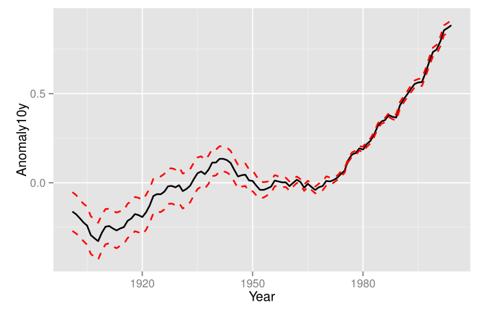
This exercise requires you to read the R documentation for ggplot2 which contains crucial clue to the solution.
> ggplot(climate, aes(Year, Anomaly10y)) +
+ geom_ribbon(aes(ymin = Anomaly10y - Unc10y, ymax = Anomaly10y + Unc10y), fill = NA, alpha = 0, linetype = "dashed", color = "red") +
+ geom_line(color = "black")
Here, I have set the fill to be NA. Setting alpha = 0 is redundant then, really. The rest of the attributes are self-explanatory.
Exercise 3
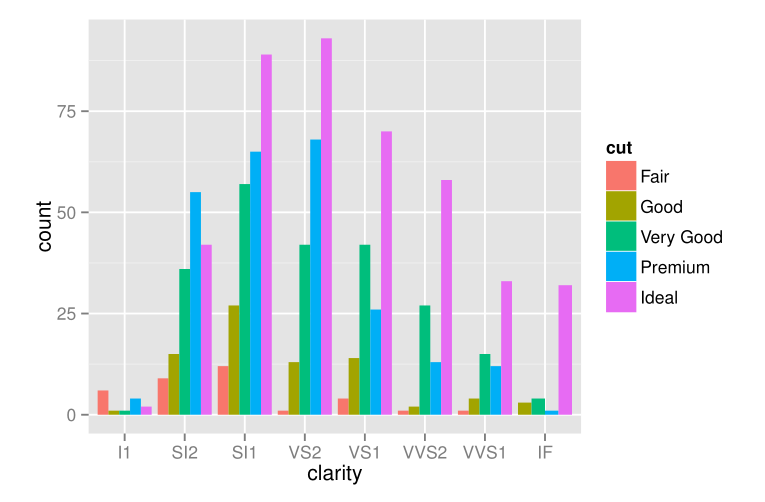
> ggplot(d2, aes(clarity, fill = cut)) +
+ geom_bar(stat = 'bin', position = 'dodge')
Pay attention to the stat attribute whenever using barplots.
The heights of the bars commonly represent one of two things: either a count of cases in each group, or the values in a column of the data frame. By default,
geom_barusesstat="bin". This makes the height of each bar equal to the number of cases in each group, and it is incompatible with mapping values to the y aesthetic. If you want the heights of the bars to represent values in the data, usestat="identity"and map a value to the y aesthetic.
Exercise 4
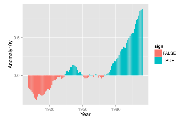
There are two parts to this problem. I have a feeling that my solution is most probably not the correct one as I have treated sign all the times as a factor and not logical.
> sign <- climate$Anomaly10y / abs(climate$Anomaly10y)
> str(sign)
 num [1:104] -1 -1 -1 -1 -1 -1 -1 -1 -1 -1 ...
> sign <- factor(sign)
> levels(sign)
[1] "-1" "1"
> levels(sign) <- c(FALSE, TRUE)
> climate <- cbind(climate, sign)
Now that we are done manipulating the data frame. You can check its structure with str(climate). Time to plot!
> ggplot(climate, aes(Year, Anomaly10y, fill = sign)) +
+ geom_bar(stat = 'identity')
Resources
- ggplot2 home page - lists relevant books and resources
- Cookbook for R chapter on Graphs
- ggplot2 intro
- ggplot2 Tutorial by Jennifer Bryan, Professor, University of British Columbia
- Christophe Ladroue’s brief 10 minute introduction to ggplot2
Leave a comment