How do the Lok Sabha Elections effect Sensex? w/ code
There’s another version of this post available that doesn’t include the R code used in analysis and generation of figures.
Source
I came across a time series analysis of German Market in the light of federal elections and decided to try the same for BSE SENSEX(Bombay Stock Exchange Sensitive Index), which is a stock market index of 30 companies listed at Dalal Street, and Indian Lok Sabha Elections.
Getting Data
I downloaded the dataset from BSEIndia.com. I believe this should also be available on Quandl.
Loading Packages
A lot of functions and operators I’ll be using here aren’t part of base R. They require either one or more of these packages to work.
    packages <- c("ggplot2", "splines", "zoo", "changepoint", "dplyr", "scales", "gridExtra", "lubridate", "MASS")

    packages <- lapply(packages, FUN = function(x) {
      if (!require(x, character.only = TRUE)) {
        install.packages(x)
        library(x, character.only = TRUE)
      }
    })
I learnt this neat recipe from the Introduction to Data Analysis course by François Briatte and Ivaylo Petev
Loading Sensex
I had to open the data and add a column to it else it wasn’t read
properly. I wrote Datum in the first line from a text editor. This
shifts all the columns to the left.
    setwd("D:/Data Science/sensex")

    bse.index <- read.csv("SENSEX.csv", stringsAsFactors = FALSE)
    head(bse.index)

    ##           Datum Date Open High    Low Close
    ## 1  3-April-1979   NA   NA   NA 124.15    NA
    ## 2  4-April-1979   NA   NA   NA 122.85    NA
    ## 3  6-April-1979   NA   NA   NA 123.52    NA
    ## 4  7-April-1979   NA   NA   NA 124.18    NA
    ## 5  9-April-1979   NA   NA   NA 124.30    NA
    ## 6 11-April-1979   NA   NA   NA 125.01    NA

    bse.index$Date <- as.Date(bse.index$Datum, format = "%d-%B-%Y")
    bse.index$Close <- bse.index$Low
As the columns have been shifted to the left. bse.index$Low has the
closing values of sensex. I had to fix that.
Lok Sabha Election Dates
The election date I chose is the date of counting of votes. When that was not available, I picked the dates when the next Lok Sabha started. There’s usually a gap of couple of days when the last Lok Sabha is dissolved and new Lok Sabha sworns in.
    elections <- as.Date(c("1980-01-18",
                           "1984-12-31",
                           "1989-12-02",
                           "1991-06-20",
                           "1996-03-10",
                           "1998-03-10",
                           "1999-10-06",
                           "2004-05-13",
                           "2009-05-16",
                           "2014-05-16"), format = "%Y-%m-%d")
What’s next?
This isn’t very different from the source analysis I mentioned above. I
initialize sensex as a zoo time-series. Paul Teetor’s R
Cookbook mentions zoo and xts as
essential time-series packages.
Here I also calculate something called rolling variance. Rolling variance can be also called moving variance. It is variance calculated on overlapping windows of time. Example, if window width is fixed at 10 then variance will be calculated on time values from 1-10 then 2-11 then 3-12 then 4-13.
rollapply() function comes in handy in this case, the first argument
is data, second argument specifies the width of the window, third
argument mentions the function that is to be applied and fourth argument
tells it to remove any NA it comes across.
    sensex <- zoo(bse.index$Close, order.by = bse.index$Date)
    rolvar <- rollapply(sensex, width = 7, var, na.rm = T)
I’m not completely convinced by using rolling variance as a measure of volatility so I will also explore other quantities.
Plot of Sensex with Rolling Variance
    par(mar = c(4, 4, 0.2, 0.2), oma = c(0, 0, 0, 0), mfrow = c(2, 1))
    plot(index(sensex), as.numeric(sensex), type = "l", xlab = "Date", ylab = "BSE Sensex")
    abline(v = elections, col = "red")
    plot(index(rolvar), as.numeric(rolvar), type = "l", xlab = "Date", ylab = "rolling variance (7 days)")
    abline(v = elections, col = "red")
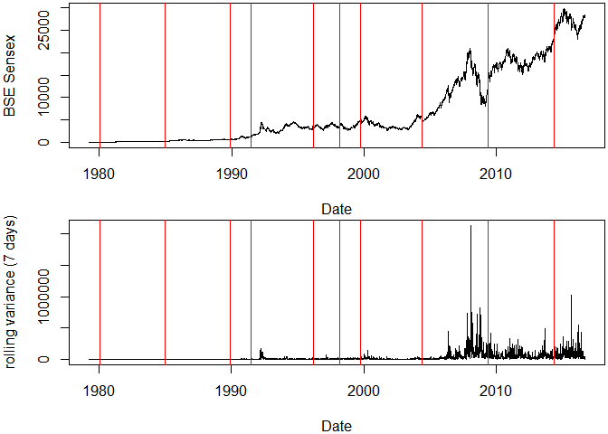
I see two things here,
- Sensex has become volatile over time.
- There is a slight hint that market is effected by the results, however it can only be seen in 2004, 2009 and 2014 elections.
Zoom In
Sensex volatality(in terms of rolling variance) 100 days before and after the election results.
    elections1 <- as.Date(c("1991-06-20", "1996-03-10", "1999-10-06", "2004-05-13", "2009-05-16", "2014-05-16"), format = "%Y-%m-%d")

    par(mar = c(4, 4, 0.2, 0.2), oma = c(0, 0, 0, 0), mfrow = c(2, 3))
    for (i in 1:6) {
        plot(index(rolvar), as.numeric(rolvar), type = "l", xlab = "Date", ylab = "rolling variance (7 days)",
            xlim = c(elections1[i] - 100, elections1[i] + 100))
        abline(v = elections1, col = "red")
        text(elections1[i] - 55, 1000000, paste("Election in\n", format(elections1[i],
            format = "%Y")), cex = 1.5)
    }
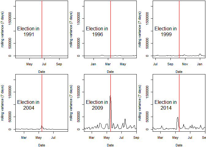
I see a sign that markets have started becoming nervous around the elections and that volatality has increased.
Need for Normalization
There’s still a problem here. Some large values in rolling variance are making it harder to see the complete picture. We need a measure that normalizes the data. Daily differences when measured in percentages might prove to be a good candidate here. They’re generally called returns.
Return on i day ri is calculated as,
\[r_i = \frac{p_i - p_{i-1}}{p_{i-1}}\]where pi is the price on day i
    bse.index <- mutate(bse.index,
           difference = c(NA, diff(Close)),
           lagged = c(NA, Close[-length(Close)]),
           rate = (Close/lagged) - 1)
I’ll ditch the zoo object and instead just use data frame bse.index
because zoo objects don’t work with ggplot2 and I don’t see an
advantage of using them right now anyway.
    ggplot(data = subset(bse.index, Date > "2000-01-01"), aes(x = Date)) +
      geom_linerange(aes(ymax = rate), ymin = 0) +
      aes(color = ifelse(rate > 0, "positive", "negative")) +
      scale_color_manual("", values = c("positive" = "#2ECC71", "negative" = "#C0392B")) +
      scale_y_continuous(labels = percent) +
      theme(legend.position = "none") +
      labs(x = NULL, y = "returns", title = "Daily Returns of Sensex since 2000")
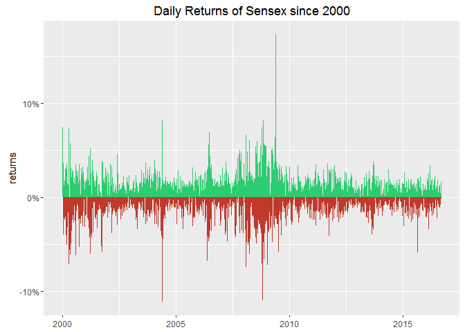
This is a complete mess! I cannot infer anything from daily values. This calls for aggregation!
Aggregating Data
I’m in two minds about aggregating the data. This data is clearly volatile enough to express meaningful daily variations but this volatality is getting in my way of clearly seeing what’s happening. Or is it?
    bse.index$year <- year(bse.index$Date)
    bse.index$month <- month(bse.index$Date)

    bse.by_month <- bse.index %>%
      group_by(year, month) %>%
      summarise(mean = mean(Close)) %>%
      ungroup() %>%
      arrange(year)

    bse.by_month$Date <- ymd(paste(bse.by_month$year, bse.by_month$month, "01", sep = "-"))
If this also shows the variations then it would imply that the elections effect market remembers the elections for more than a day or two!
    ggplot(data = subset(bse.by_month, year > 2000), aes(x = Date, y = mean)) +
      geom_line() +
      geom_smooth(method = 'lm') +
      geom_vline(xintercept = as.numeric(elections), linetype = "longdash", color = "#444444", size = 0.1) +
      labs(x = NULL, y = "Monthly Averages", title = "Sexsex (since 2000)")
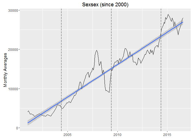
There’s a clear linear trend visible. This is an example of a non-stationary time-series. We can detrend it to make it stationary, in other words make it horizontal.
Detrending a time series isn’t complex to understand once we’re clear about what is to be done here. I want to remove the upward linear trend from this series without effecting the shape at all. Or I want to subtract the linear trend from the time series.
- Make a linear model with variables on y and x axis.
    bse.by_month.2000 <- subset(bse.by_month, year > 2000)
    ct <- lm(bse.by_month.2000$mean ~ bse.by_month.2000$Date)
Linear model is essentially a line. For each point on x-axis, there’s a point on y-axis corresponding to the line. These set of points on y-axis are called fitted values. To detrend, I just need to subtract the data from fitted values for the whole x-axis.
yi − (β1xi+β2)
β1 and β2 are parameters from the linear
model. This difference is called residuals in regression theory. There’s
a handy function resid() that calculates it given the linear model.
- Plot the residuals
    qplot(x = bse.by_month.2000$Date, y = resid(ct), geom = "line") +
      geom_vline(xintercept = as.numeric(elections), linetype = "longdash", color = "#444444", size = 0.1) +
      labs(x = NULL, y = "residuals", title = "Detrended Sensex (since 2000)") +
      geom_smooth(method = "lm")
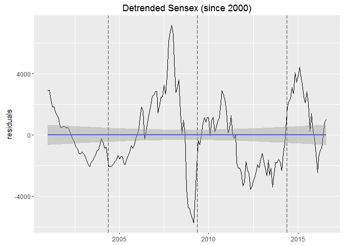
Now this is somewhat smooth, I should plot the returns to see the effect more pronounced
    bse.by_month.2000 <- mutate(bse.by_month.2000,
           difference = c(NA, diff(mean)),
           lagged = c(NA, mean[-length(mean)]),
           rate = (mean/lagged) - 1)

    ggplot(data = bse.by_month.2000, aes(x = Date)) +
      geom_linerange(aes(ymax = rate), ymin = 0) +
      geom_vline(xintercept = as.numeric(elections), linetype = "longdash", color = "#444444", size = 0.1) +
      scale_x_date(date_breaks = "2 year", date_labels = "%Y") +
      aes(color = ifelse(rate > 0, "positive", "negative")) +
      scale_color_manual("", values = c("positive" = "green", "negative" = "red")) +
      theme_minimal() +
      theme(legend.position = "none") +
      scale_y_continuous(labels = percent) +
      labs(x = NULL, y = "return", title = "BSE Sensex Monthly returns since 2000")
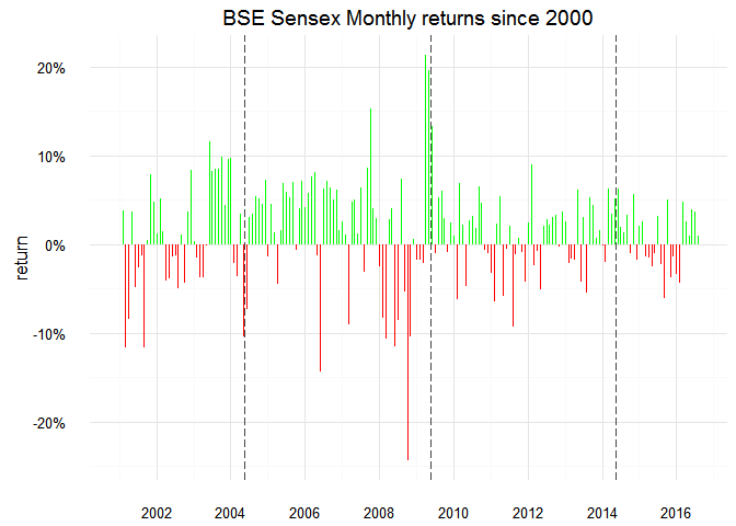
Whoa a 20% crash!
    which(abs(bse.by_month.2000$rate) > .2)

    ## [1]  94 100

    bse.by_month.2000[seq(92, 102), ]

    ## # A tibble: 11 x 7
    ##     year month      mean       Date  difference    lagged        rate
    ##    <dbl> <dbl>     <dbl>     <date>       <dbl>     <dbl>       <dbl>
    ## 1   2008     8 14722.133 2008-08-01  1005.94909 13716.184  0.07334030
    ## 2   2008     9 13942.808 2008-09-01  -779.32538 14722.133 -0.05293563
    ## 3   2008    10 10549.647 2008-10-01 -3393.16012 13942.808 -0.24336276
    ## 4   2008    11  9453.957 2008-11-01 -1095.69083 10549.647 -0.10386042
    ## 5   2008    12  9513.584 2008-12-01    59.62762  9453.957  0.00630716
    ## 6   2009     1  9350.417 2009-01-01  -163.16729  9513.584 -0.01715098
    ## 7   2009     2  9188.033 2009-02-01  -162.38437  9350.417 -0.01736654
    ## 8   2009     3  8995.451 2009-03-01  -192.58163  9188.033 -0.02096005
    ## 9   2009     4 10911.198 2009-04-01  1915.74724  8995.451  0.21296845
    ## 10  2009     5 13046.145 2009-05-01  2134.94626 10911.198  0.19566561
    ## 11  2009     6 14782.468 2009-06-01  1736.32368 13046.145  0.13309094
I need to look in the daily charts for this,
I will also change the positive color to blue as this shade of green isn’t apparent in front of the white background.
    ggplot(data = subset(bse.index, year == 2008), aes(x = Date)) +
      geom_linerange(aes(ymax = rate), ymin = 0) +
      facet_wrap(~month, scales = "free_x", ncol = 3) +
      scale_y_continuous(labels = percent) +
      aes(color = ifelse(rate > 0, "positive", "negative")) +
      scale_color_manual("", values = c("positive" = "blue", "negative" = "red")) +
      scale_x_date(date_breaks = "1 week", date_labels = "%W") +
      theme(legend.position = "none") +
      labs(y = "return", x = "Week", title = "BSE Sensex in the year 2008")
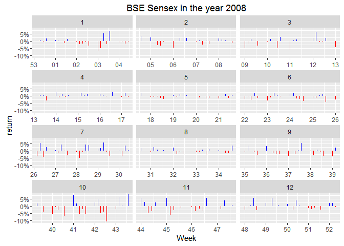
I’m thinking mean change(in percent) for the month might be better able to represent the volatility through the month.
2008 has surely been a rough year. The 10% fall visible in the month of October is the largest crash ever from BSE Sensex. Let’s check how other years compare to this.
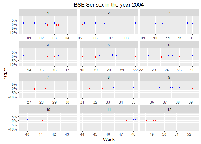
Look at the 5th month! The results came out on 16th May, 2004 and clearly the market was more nervous than anytime in the year! If I’m not wrong, I should see a similar trend in the year 2009.
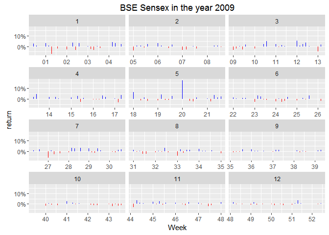
Trivia: Stable governments imply date of elections do not change. Results for general elections have been coming out exactly around 3rd week of May every 5 years in 21st century.
I can set the y-axis scale free to adjust itself for the values in each facet but that wouldn’t emphasize the difference between May and other months.
“Investors rejoiced the coming of a stable government in power. Bulls got encouraged as investors were screaming to buy in apprehension that stability will come in the economic policies,” brokerage firm Unicorn Financial CEO G Nagpal said.
There’s a clear spike of massive 15%. Market looks like in indifference till the results are announced followed by a sigh of relief. Markets like political stabiity. 2009 elections meant 5 more years of nearly the same economic policy. [1]
Back to the election spike, Is this statistically significant? Is that even a right question to ask?
I’m exciting to see how does Modi’s election look like. If I remember correctly Congress never even looked like they had a chance. There was some nervousness about a messy coalition government involving the 3rd front but market would have loved as one party got the required majority to make the government.
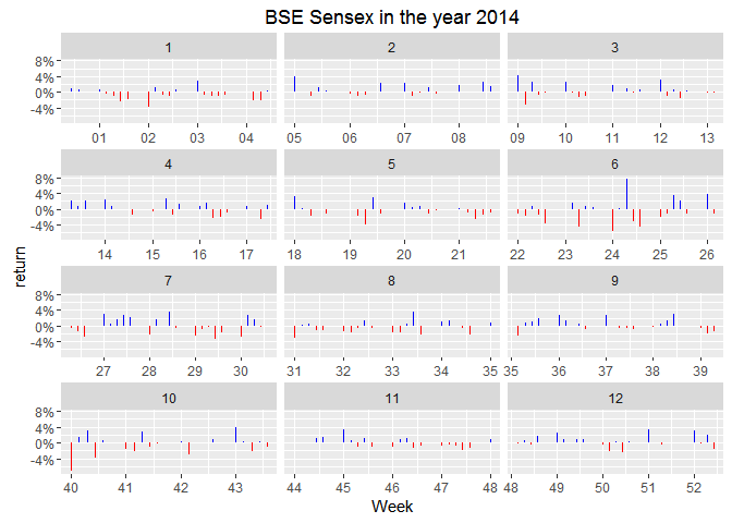
Look at the 5th panel, this is interesting! I was completely wrong! There’s no sign of nervousness for the chance of a coalition government, which is odd.
Log-Returns
Financial analysts love log-returns. Paul Teetor mentions in R Cookbook that volatility is measured as the standard deviation of daily log-returns.
This makes log-returns relevant to the subject of this post. In my quest to find “How does Lok Sabha Election effect Sensex”, I’ve failed to find a direct correlation between the two. Using log-returns I can check if it makes the market volatile or, in a way, nervous. :P
Let’s plot a couple of graphs to see where do they take us. I’ll make
use of the fun themes in ggthemes package.
library(ggthemes)
elections <- data.frame(Date = as.Date(c("1980-01-18", "1984-12-31", "1989-12-02", "1991-06-20", "1996-03-10", "1998-03-10", "1999-10-06", "2004-05-13", "2009-05-16", "2014-05-16"), format = "%Y-%m-%d"))
elections$year <- year(elections$Date)
bse.index <- mutate(bse.index,
log.returns = c(NA, diff(log(Close))))
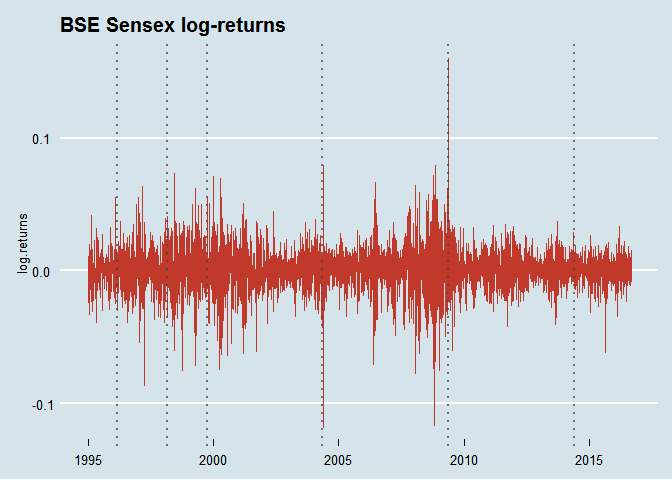
ggplot(data = subset(bse.index, year >= 1995), aes(x = Date, y = log.returns)) +
geom_line(color = "#C0392B") +
theme_economist() +
labs(x = NULL, title = "BSE Sensex log-returns") +
geom_vline(xintercept = as.numeric(elections$Date), linetype = "dotted", color = "#444444", size = 1, alpha = 0.75)
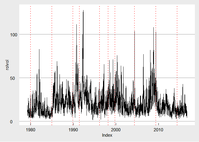
Also take a look at how volatility has changed over time. For this I
need to calculate the rolling volatility in Sensex using rollapply().
Did I mention that autoplot() can be used with zoo objects to make
them compatible with ggplot layers?
    ret <- zoo(bse.index$log.returns, bse.index$Date)
    rolvol <- rollapply(ret, width = 7, FUN = function(x) {sqrt(252) * sd(x, na.rm = TRUE) * 100}, fill = NA)

    autoplot(rolvol) +
      geom_vline(xintercept = as.numeric(elections$Date), linetype = "dotted", color = "red", size = 1, alpha = 0.75) +
      theme_economist_white()
I need a grid to see the volatility around elections!
    p <- list()

    for (i in 1:10) {
      p[[i]] <- qplot(x = index(rolvol), y = coredata(rolvol), geom = "line") +
      coord_cartesian(xlim = c(elections$Date[i] - 100, elections$Date[i] + 100)) +
      geom_vline(xintercept = as.numeric(elections$Date), linetype = "dotted", color = "#C0392B", size = 1) +
      labs(x = NULL, y = NULL, title = as.character(elections$year[i])) +
      scale_x_date(date_breaks = "2 month", date_labels = "%b")
    }

    do.call(grid.arrange,c(p, ncol = 2, top = "Volatility in BSE Sensex with General Elections"))
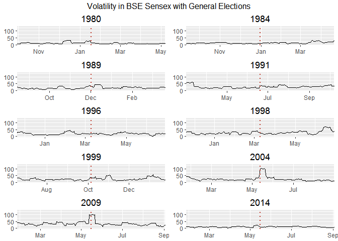
This looks like the conclusive graph I was looking for. Sensex was nervous when an economist became the prime minister. Hah!
So, do the Lok Sabha elections make Sensex nervous? Well, it only made them nervous in 2004 and 2009. There’s a kind of apparent indifference that is widespread here.
Addressing the real oddity in the room,
Why was market so indifferent to general elections before 2000? (and even 2014)
One simple explanation is that market doesn’t care about elections at all and 2004, 2009 were plain coincidences.
Another explanation might be that indifference is a negative reaction. I’m probably missing something substantial as 1991 was a crucial year for Indian Economy but the market charts don’t show that at all!
    bse.by_month <- mutate(bse.by_month,
                           lagged = c(NA, mean[-length(mean)]),
                           change = (mean/lagged) - 1)
Grid of charts,
    p <- list()

    for (i in 1:10) {
      p[[i]] <- ggplot(data = subset(bse.by_month, year == elections$year[i]), aes(x = Date, y = change)) +
        geom_bar(stat = "identity") +
        aes(fill = ifelse(change > 0, "positive", "negative")) +
        scale_fill_manual("", values = c("positive" = "#2ECC71", "negative" = "#C0392B")) +
        scale_y_continuous(labels = percent) +
        theme(legend.position = "none") +
        scale_x_date(date_breaks = "2 month", date_labels = "%b") +
        labs(x = NULL, y = NULL, title = as.character(elections$year[i])) +
        geom_vline(xintercept = as.numeric(elections$Date), linetype = "dotted", color = "#444444", size = 1, alpha = 0.75)
    }

    do.call(grid.arrange,c(p, ncol = 2, top = "BSE Sensex Monthly Returns"))
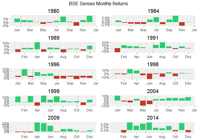
When I switch to daily variations,
    p <- list()

    for (i in 1:10) {
      p[[i]] <- ggplot(data = bse.index, aes(x = Date, y = rate)) +
        geom_line() +
    #    aes(color = ifelse(change > 0, "positive", "negative")) +
    #    scale_color_manual("", values = c("positive" = "#2ECC71", "negative" = "#C0392B")) +
        scale_y_continuous(labels = percent) +
        theme(legend.position = "none") +
        scale_x_date(date_breaks = "2 month", date_labels = "%b") +
        labs(x = NULL, y = NULL, title = as.character(elections$year[i])) +
        geom_vline(xintercept = as.numeric(elections$Date), linetype = "dotted", color = "#C0392B", size = 1) +
        theme_minimal() +
        coord_cartesian(xlim = c(elections$Date[i] - 100, elections$Date[i] + 100))
    }

    do.call(grid.arrange,c(p, ncol = 2, top = "Returns in BSE Sensex in election years"))
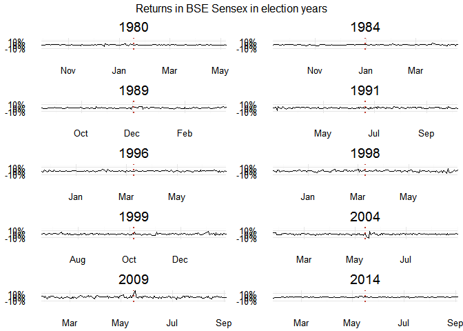
This isn’t all that helpful. There’s something important that’s still missing. We need insights!
Other Analysis Methods I Missed
Changepoints Analysis
Changepoint algorithms find abrupt variations in the series. [2]
    ggplot(data = subset(bse.index, year == 2004), aes(x = Date, y = Close)) +
      geom_point(color = "blue", alpha = .8) +
      geom_line(color = "gray80") +
      geom_smooth(method = "rlm", formula = y ~ ns(x, 12), alpha = .25, fill = "lightblue") +
      labs(x = NULL, y = NULL, title = "BSE Sensex with a cubic spline") +
      geom_vline(xintercept = as.numeric(elections$Date), linetype = "dotted", color = "#C0392B", size = 1)
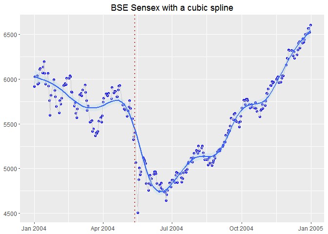
I can also add changepoints to this mix,
cpt2 <- cpt.mean(subset(bse.index, year == 2004)$Close, method = "BinSeg")
Add the segments, and a vertical blue line to show election
    plot(cpt2, main = "BSE Sensex in 2004 w/ changepoints")
    abline(v = 91, col = "blue")
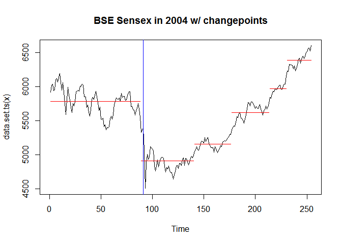
That looks good! Election is a changepoint! You might have noticed the magic number 91 that comes out of nowhere. I didn’t make that up. I can’t overlay date as-is because they’re not the same data-type. However, I can show
    bse.2004 <- subset(bse.index, year == 2004)
    bse.2004 <- dplyr::select(bse.2004, Date, Close)
    bse.2004 <- na.omit(bse.2004)
    which(bse.2004$Date == elections$Date[8])
    ## [1] 91
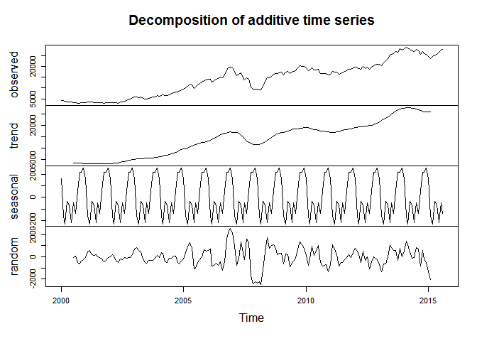
Decomposition
I just learnt that base R supports a time series class that can be
initialized with ts(). It has some cool functions, one being
decompose. This should be an aside.
    sensex.ts <- ts(bse.by_month.2000$mean, frequency = 12, start = c(2000, 01))
    d <- decompose(sensex.ts)
    plot(d)
Intervention Analysis
There’s something called intervention analysis that was referred by a lot of people in this question at Research Gate. Someone here also mentions introducing dummy variables which I didn’t quite understood.
Feedback
This post was my attempt to learn more about analysis of data and time serieses. Please let me know your thoughts and if I missed something!
Footnotes
- That makes me think how much difference is really there in the financial policies of UPA and NDA governments, is it possible to measure?
- changepoint: An R Package for Changepoint Analysis, Rebecca Killick and Idris A. Eckley, 2013
Leave a comment